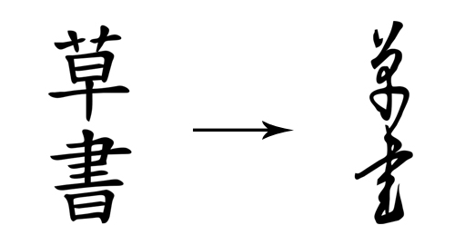
Chinese Characters
Chinese characters are symbols that do not comprise an alphabet. This writing system, in which each character generally represents either a complete one-syllable word or a single-syllable part of a word, is called logo-syllabic. This also means that each character has its own pronunciation, and there is no way to guess it. Add to this the fact that being literate in Chinese requires memorizing about 4,000 characters and you’ve got quite a language to learn. Fortunately for us, we don’t need to learn Chinese in order to appreciate the beauty of its writing.
Because many commonly used Chinese characters have 10 to 30 strokes, certain stroke orders have been recommended to ensure speed, accuracy and legibility in composition. So, when learning a character, one has to learn the order in which it is written, and the sequence has general rules, such as: top to bottom, left to right, horizontal before vertical, middle before sides, left-falling before right-falling, outside before inside, inside before enclosing strokes.
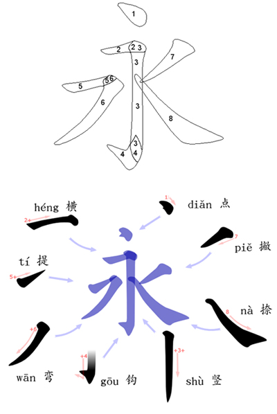
The Eight Principles of Yong
The strokes in Chinese characters fall into eight main categories: horizontal (一), vertical (丨), left-falling (丿), right-falling (丶), rising, dot (、), hook (亅) and turning (乛, 乚, 乙, etc.). The “Eight Principles of Yong” outlines how to write these strokes, which are common in Chinese characters and can all be found in the character for “yǒng” (永, which translates as “forever” or “permanence”). It was believed that practicing these principles frequently as a budding calligrapher would ensure beauty in one’s writing.
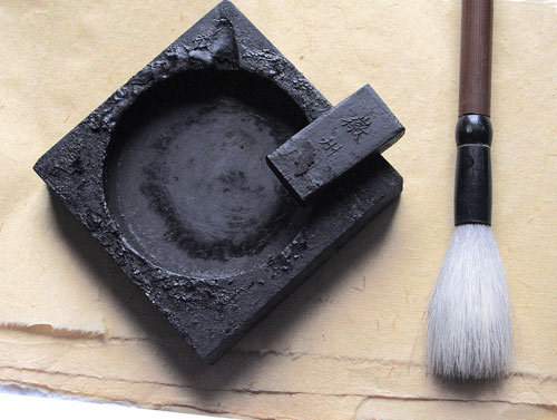
Four Treasures of the Study
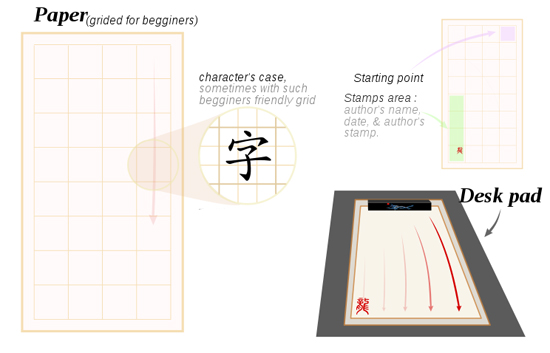
“Four treasures of the study” is an expression that refers to the brush, ink, paper and ink stone used in Chinese and other East Asian calligraphic traditions. The head of the brush can be made of the hair (or feather) of a variety of animals, including wolf, rabbit, deer, chicken, duck, goat, pig and tiger. The Chinese and Japanese also have a tradition of making a brush from the hair of a newborn, as a once-in-a-lifetime souvenir for the child.
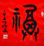
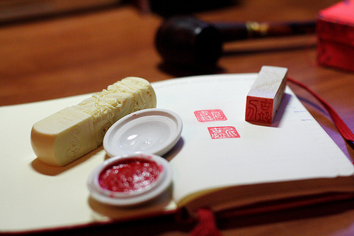
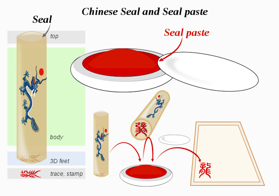
Seal and Seal Paste
The artist usually completes their work of calligraphy by adding their seal at the very end, in red ink. The seal serves as a signature and is usually done in an old style.
Horizontal and Vertical Writing
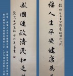
Many East Asian scripts (such as Chinese, Japanese and Korean) can be written horizontally or vertically, because they consist mainly of disconnected syllabic units, each conforming to an imaginary square frame. Traditionally, Chinese is written in vertical columns from top to bottom; the first column on the right side of the page, and the text starting on the left.
In modern times, using a Western layout of horizontal rows running from left to right and being read from top to bottom has become more popular. Signs are particularly challenging for written Chinese, because they can be written either left to right or right to left (the latter being more of a traditional layout, with each “column” being one character high), as well as top to bottom.
Different Styles
In Chinese calligraphy, Chinese characters can be written in five major styles. These styles are intrinsic to the history of Chinese script.
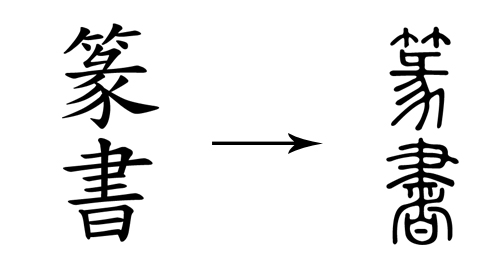
Seal script is the oldest style and continues to be widely practiced, although most people today cannot read it. It is considered an ancient script, generally not used outside of calligraphy or carved seals, hence the name.
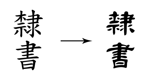
In clerical script, characters are generally “flat” in appearance. They are wider than the seal script and the modern standard script, both of which tend to be taller than wider. Some versions of clerical are square, and others are wider. Compared to seal script, forms are strikingly rectilinear; but some curvature and influence from seal script remains.
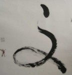
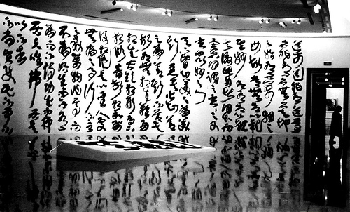
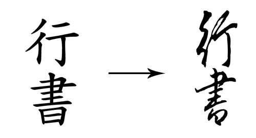
The semi-cursive script approximates normal handwriting, in which strokes and (more rarely) characters are allowed to run into one another. In writing in the semi-cursive script, the brush leaves the paper less often than with the regular script. Characters appear less angular and rounder. The characters are also bolder.
The cursive script is a fully cursive script, with drastic simplifications and ligatures, requiring specialized knowledge to be read. Entire characters may be written without lifting the brush from the paper at all, and characters frequently flow into one another. Strokes are modified or eliminated completely to facilitate smooth writing and create a beautiful abstract appearance. Characters are highly rounded and soft in appearance, with a noticeable lack of angular lines.
The regular script is one of the last major calligraphic styles to develop from a neatly written early-period semi-cursive form of clerical script. As the name suggests, this script is “regular,” with each stroke written slowly and carefully, the brush being lifted from the paper and all strokes distinct from each other.

| < Prev | Next > |
|---|
- 2009-03-25 - 得“自然”,备“古雅”--评米芾书法(转载)
- 2008-12-15 - 书法浅识(四) 转载
- 2008-12-14 - 书法浅识(三) 转载
- 2008-12-13 - 书法浅识(二) 转载
- 2008-12-13 - 书法浅识(一) 转载
- 2008-12-10 - 字里千秋,中国的书法艺术
- 2008-12-02 - 汉字书法的意境美
- 2008-11-08 - "丑"之为美:兼谈书法的审美标准(书法美学)
- 2008-09-28 - Ding Shimei "Yin Yang" (2008AD) Seal Script,
- 2008-09-16 - 转文恒山