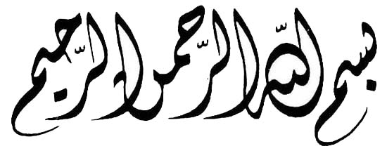
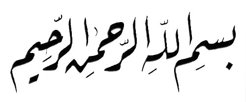
Arabic
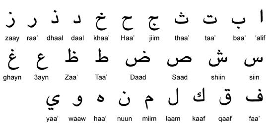
Here we’ll explore the beauty of Arabic, which has many styles and techniques. The Arabic alphabet was developed from the Nabataean script (which was itself derived from the Aramaic script) and contains a total of 28 letter. These 28 letters come from 18 basics shapes, to which one, two or three dots are added, above or below the letter. Arabic uses a writing system that we haven’t seen yet: an abjad, which is basically an alphabet that doesn’t have any vowels—the reader must supply them.
Contextual Shaping
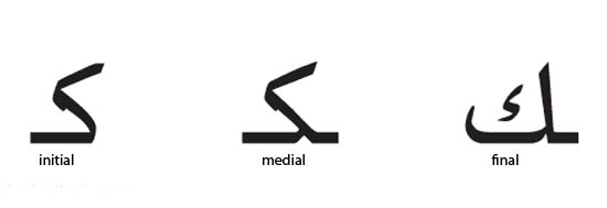
The shape of these letters changes depending on their position in the word (isolated, initial, medial or final). Here, for example, is the letter kaaf:
Diacritics
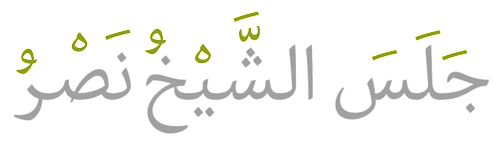
The Arabic script is an impure abjad, though. Short consonants and long vowels are represented by letters, but short vowels and long consonants are not generally indicated in writing. The script includes numerous diacritics, which serve to point out consonants in modern Arabic. These are nice and worth taking a look at.
Alif as a Unit of Proportion
Geometric principles and rules of proportion play an essential role in Arabic calligraphy. They govern the first letter of the alphabet, the alif, which is basically a straight vertical stroke.
- The height of the alif varies from 3 to 12 dots, depending on the calligrapher and style of script.
- The width of the alif (the dot) is a square impression formed by pressing the tip of the reed pen to paper. Its appearance depends on how the pen was cut and the pressure exerted by the fingers.
- The imaginary circle, which uses alif as its diameter, is a circle within which all Arabic letters could fit.

Different Styles
Arabic script has many different styles—over 100 in fact. But there are six primary styles, which can generally be distinguished as being either geometric (basically Kufic and its variations) and cursive (Naskh, Ruq’ah, Thuluth, etc.).
Kufi (or Kufic) is noted for its proportional measurements, angularity and squareness.
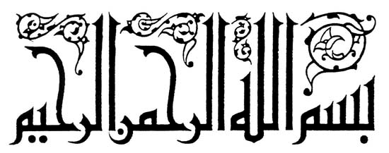
Tuluth means “one third,” referring to the proportion of the pen relative to an earlier style called Tumaar. It is notable for its cursive letters and use as an ornamental script.
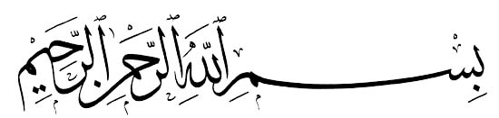
Nasakh, meaning “copy,” is one of the earliest scripts with a comprehensive system of proportion. It is notable for its clarity for reading and writing and was used to copy the Qur’an.
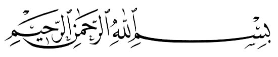
Ta’liq means “hanging,” in reference to the shape of the letters. It is a cursive script developed by the Persians in the early part of the 9th century AD. It is also called Farsi (or Persian).
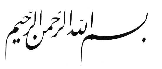
Diwani was developed by the Ottomans from the Ta’liq style. This style became a favorite script in the Ottoman chancellery, and its name is derived from the word “Diwan,” which means “royal court.” Diwani is distinguished by the complexity of lines within letters and the close juxtaposition of letters within words.
Riq’a is a style that evolved from Nasakh and Thuluth. It is notable for the simplicity and small movements that are required to write in it, thanks to its short horizontal stems, which is why it is the most common script for everyday use. It is considered a step up from the Nasakh script, which children are taught first. In later grades, students are introduced to Riq’a.
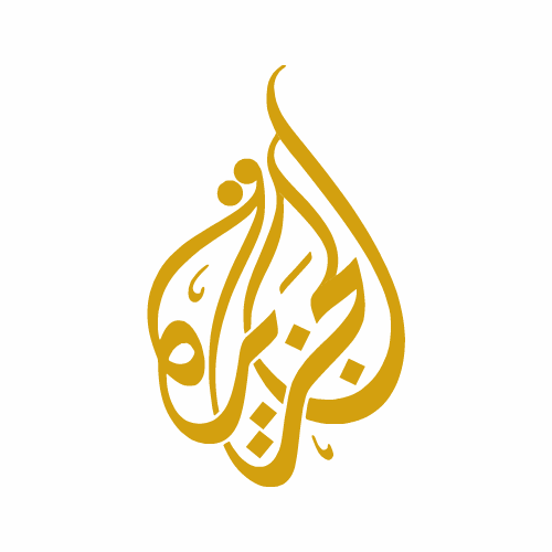
Teardrop-Shaped Composition
Here is an animation showing the composition of the Al Jazeera logo:
| < Prev | Next > |
|---|
- 2009-03-25 - 得“自然”,备“古雅”--评米芾书法(转载)
- 2008-12-15 - 书法浅识(四) 转载
- 2008-12-14 - 书法浅识(三) 转载
- 2008-12-13 - 书法浅识(二) 转载
- 2008-12-13 - 书法浅识(一) 转载
- 2008-12-10 - 字里千秋,中国的书法艺术
- 2008-12-02 - 汉字书法的意境美
- 2008-11-08 - "丑"之为美:兼谈书法的审美标准(书法美学)
- 2008-09-28 - Ding Shimei "Yin Yang" (2008AD) Seal Script,
- 2008-09-16 - 转文恒山