外来语推动中国的现代化
有关部门下发通知,要求在电视媒体上屏蔽一些英文缩略词,如NBA、CBA、F1、GDP、WTO、 CPI等等,取而代之的是中文全称,如NBA改称“美国职业篮球联赛”,CBA改称“中国男子篮球职业联赛”。其实,这个屏蔽涉及到很多文化传播中疑问,比如英文缩略词的功能是什么,是否会侵害汉语,其本质命题是,我们该如何看待外来语。
Sun06212026
Last update08:15:27 pm

有关部门下发通知,要求在电视媒体上屏蔽一些英文缩略词,如NBA、CBA、F1、GDP、WTO、 CPI等等,取而代之的是中文全称,如NBA改称“美国职业篮球联赛”,CBA改称“中国男子篮球职业联赛”。其实,这个屏蔽涉及到很多文化传播中疑问,比如英文缩略词的功能是什么,是否会侵害汉语,其本质命题是,我们该如何看待外来语。
Last Updated on Sunday, 15 August 2010 15:51
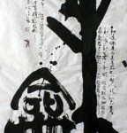
1910年以后,中国出现了三位对草书艺术做出巨大贡献的伟大书法家,一个是于右任,他规范了草书的字型;一个是林散之,他刷新了草书的面貌;一个便是毛泽东,他由于特殊的政治地位,极大的个人天赋,突出的书法艺术实践成就,重兴了草书艺术,承继了重绝之学。
就书法艺术而言,最能代表一个人艺术成就,并能最好表达艺术家个性的,莫过于草书。古人有云:“书,如也。如其学,如其才,如其志,总之曰:如其人而已。”换言之,书法艺术的本质是表现个性。梁启超讲过:“个性的表现,各种美术都可以,即如图画、雕刻、建筑,无不有个性存在乎其中,但是表现的最亲切、最真实,莫如写字。”毛泽东书法艺术的集大成者是草书,他对书法艺术最伟大的贡献也是草书。
Last Updated on Sunday, 15 August 2010 15:50
日前,22个中国申报项目经批准列入《人类非物质文化遗产代表作名录》,中国传统的书法艺术赫然在列。有着广泛群众基础的书法与“遗产”和“保护”联系到了一起,这对书法的传承会起到怎样的作用?
Last Updated on Sunday, 15 August 2010 15:49
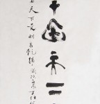
漢末蔡邕說:「書有二說,一曰疾,一曰澀,得疾澀二法,書妙矣」
Chinese calligraphy has a special theory and a concept called “Gee & Se ( 疾 澀 ).” "Gee" means fast while "Se" means not slippery, and somewhat slow. These two words are to be understood in metaphysical and artistic perspectives rather than in literal meanings. Gee and Se are the two sides of a coin. They can only be obtained by understanding and applying the Center Tip Principle ( 中 鋒 ). This is why ancient Chinese calligraphers always overstressed the importance of the Center Tip Theory.
In contrast, Western and Japanese calligraphy mostly don’t have the “Gee & Se” effects (except very few Japanese master calligraphers). Japanese calligraphy usually looks more fast and somewhat slippery which is the opposite of “Se.”
Nowadays many Chinese calligraphers don’t understand the concept of “Gee & Se” at all. Some may have never heard of it or may misunderstand and twist it. Some Chinese calligraphers may also interpret this metaphysical concept differently from each other. And some of them try to blend Western and Japanese approaches into Chinese calligraphy. The artistic levels of blended approaches may vary depending on the individual artist’s level and insight.
With the Center Tip Principle, a highly regarded Chinese calligraphy work will generate the following effects:
We all know writing on paper is a two-dimensional activity while sculpting is three-dimensional. However, this is not so for a Chinese calligrapher who has reached a level that can exemplify “Gee & Se.” If a calligraphy work has attained the effect of Awl Drawing on Sand, it looks like at least three-dimensional. When an awl is used to draw on sand, the sand renders two waves alongside each stroke. If the awl goes in deeply enough, the waves will be higher and more magnificent. Since the sand is never slippery, it has frictions when an awl is traveling on it. The more friction it has, the less likely the work will look plain, superficial, or just two-dimensional.
Taking Yen Jen-Ching’s ( 顏 真 卿 ) famous work for example, when we observe the top three characters in the left column, they have different shades of ink density. They look as if the second character is flowing on top of the first one on a different level of plane; the third character also looks like flowing on top of the second character, and so on. When we take a closer look of the entire work, we may find some characters flowing on other levels of dimension compared with their preceding characters. This makes a Chinese calligraphy work looks like a multi-dimensional display (only if the viewer knows how to appreciate!)
A Chinese calligraphy work using the Center Tip technique will also have the effect of “Pressing A Seal.” When a seal is pressed onto a piece of paper, it usually looks more solid, firm, and deeper than an ordinary writing and is "unmovable" and "undetachable." With the vertical force going through the paper from the brush tip, such effect can only be exemplified using the Center Tip Principle.
If a work is not done with enough Center Tip technique, most of the strokes in a character will look weak as if they are detachable. They will look like a building without strong foundation and framework as if its structures can be easily detached or knocked down. (This is also a way to tell good Chinese calligraphy works from bad ones for anyone who has not even learned Chinese calligraphy at all.)
顏真卿的"屋漏痕"本指天雨屋漏,雨水從漏處滲出,沿著牆壁表面蜿蜒流下。由于水
性向下,故水珠重心必居中央,而牆面由于凹凸不平,所以屋漏下滴非一瀉直下,牆
面凸起部分漏水所受阻力小,其流自暢,其勢則疾,而其跡乃真,凹下部分則反之,所以
屋漏之水,雖自上而下,大致垂直,但細處自必蜿蜒曲折,節節頓挫。
Another effect generated by the Center Tip Principle is the Cracking Wall (or House) Effect. Say we want to hang a picture on the wall so we put a nail into the wall. If the hammer and nail are not strong enough, we just make a hole for the picture. But if the hammer VERTICALLY strikes the nail in with MORE POWER, the wall may crack. Furthermore, if we use a powerful drill to make a hole, the wall cracks more and the house may be even knocked down. This is why a master calligrapher’s work usually gives the viewers an overwhelming impression if s/he knows how to apply the vertical force. This effect can be made clear with the Center Tip Principle because a brush is required to stay vertical and the brush tip should be centered during each stroke's operation almost all the time.
In the Tang Dynasty when Chinese calligraphy reached its peak, calligraphers deeply stressed the criterion of “Wu Lo Heng” for good works. Yen Jen-Ching used to explain this concept to the famous Tsao Shu specialist Huai Su. So they both inherited those secrets from Zhang Shui and the other predecessors. Huai Su also pointed out the cracking effect should look natural, not man-made or mechanical. (Please understand when we write, we don’t want to tear or crack the paper. The above-mentioned ideal effects are more in artistic and metaphysical senses rather than physical exertions. So don’t pretend to generate those effects from literal explanation or without comprehension of Chinese calligraphy theories.)
Last Updated on Tuesday, 17 August 2010 15:42
戏曲之乡、翰墨之乡、词赋之乡……这些都是在描述一个名叫霸州的地方。
河北省霸州市是一座拥有着深厚历史的文化古城。胜芳、高桥、燕家务的古乐可以追溯至商代,胜芳古镇历史悠久,还有千年龙泉寺、百年古祠堂,益津八景,名人故居……都在滋润着霸州这片文化的土壤。
文化赋予了霸州不同寻常的魅力。在区域竞争日益激烈的今天,霸州人深切感受到文化的力量。近年来,通过对文化资源的整合、对文化事业的培育和建设、对文化产业的重视,霸州逐渐走出了一条独具特色的地域发展之路。
Last Updated on Friday, 13 January 2012 16:01
中国的书法,本与汉字相伴而生。其发展与应用的诸多形式,无不深深植根于由实用需要、审美取向与文化理想共筑的情境之中。书法因情境而得生命,情境因书法而增内涵,由此形成整体的书法文化生态。
在当代,书法生存发展的环境与机制发生了深刻变化。伴随着社会的现代化进程和电脑的普及,纸墨笔砚似乎正在默默退出我们的生活。书法,作为一种从古代流传下来、象征精神层面的艺术,被高高供奉起来,令普通百姓敬而远之。它与时代生活、社会环境和日常生活的关系,成为无法回避的重要课题。
2月8日到3月1日,如果你走进北京中国美术馆,你会看到一个充满俗世生活色彩、让人徘徊回味不已的书法大观——“情境书法大展”。它会告诉我们,在并不久远的过去,书法曾遍布中华大地,并且渗透于我们生活的每一个角落;在今天,它一样可以以文化的温润,抚慰人们劳碌烦躁的心灵。
Last Updated on Friday, 13 January 2012 16:06


 Feed
Feed