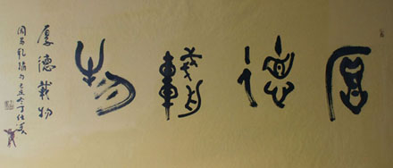
Having studied how to hold and wield the brush and how to write the basic strokes, our next step is to study the structure of Chinese characters-arrangement, rational layout and formation of beautiful style. In architecture you need building materials, component parts, a building design, etc., in order to construct a high-rise building, a big hall or a palace. You must study the overall layout and the structure of different parts in the interior of the building. You must study its location and architectural style in the entire city as well.
The same is true of handwriting. To study beautiful handwriting, you must study the arrangement of individual strokes-the structure. At the same time you must study the form of the whole character. The position and function of each character in calligraphy are its presentation.
Since ancient times Chinese calligra-phers have laid stress on the rules of structure. Many writings have appeared on the subject. Each has its strong points. I shall give you a rough idea from my personal experience in handwriting. There are five essential points: pingzheng, yunchen, rangjiu, xietiao and bianhua.
Pingzheng
This term means the dash, or horizontal stroke, must be level, or flat, and the perpendicular downstroke must be exactly upright. This is the basic principle in word structure. To achieve this end, it is important to know the center of gravity of the character. If the center of gravity is balanced and steady, the form of the character can easily become pingzheng.
In the characters , ,, the perpendicular stroke is the center of gravity. If you write this stroke well and place it in a suitable place, the center of gravity will be balanced and steady.
The viewer will get a sense of balance from the character. Some characters are not balanced. They gravitate to one side, as in , , ,.Yet there is still a center ot gravity in each character. When you write it, the center of each character should be balanced. The strokes may lean to one side, yet the center is still balanced. The character consists of two , one placed above the other. The strokes tend to lean to one side, but the axis is the same. Take the character , for example. No stroke is exactly in the middle, but the short vertical stroke forms the center of gravity. The calligrapher Sun Quoting (c 648-c 703) once remarked that in studying layout the beginner should aim at ping-zheng. Pingzheng is crucial in word structure.
Yunchen
This refers to the suitable arrangement of complicated and simple strokes, fat and lean strokes and long and short strokes in the same character. The suitable arrangement of these strokes gives one a sense of good balance and fine proportion. Take, for example, the characters , , , . Each character has few strokes. You have to use heavy strokes and spread them out a bit. The characters , have many strokes. The structure must be compact. The shape of the character must be slender and vigorous.
In the characters and you find a repetition of horizontal and vertical strokes, three horizontal strokes in . and four vertical strokes in . The distance between strokes is more or less the same. The long and short strokes are mixed. In writing the first stroke must be heavy. The length of the stroke is in between. The second stroke must be short. The third stroke should be the longest, but thinner.
The Chinese term yunchen means well proportioned. The arrangement of long and short or large and small strokes gives the viewer a sense of harmony. This calls for a suitable arrangement of fat and lean strokes. The complicated and simple strokes must be well proportioned. Yunchen is the second important principle of word structure in the Chinese language.
Rangjiu
This refers to structural arrangement of the character. When you find an incongruity between left and right, top and bottom, large and small, tall and short, etc., you must try to make the part that is out of place with the rest less incongruous. Draw a distinction between the principal stroke and the subordinate stroke and harmonize them.
In characters such as , , , the left side is taller than the right. Make the left side no more conspicuous than the right side.
In the characters ,, the right side is taller than the left. Make the right side no more conspicuous than the left.
In the characters ,,,the left side is more complicated and larger than the right side. Make the left side no more conspicuous than the right.
In the characters , , , and similar characters that tend to be onesided, the right side is complicated and the left side is simple. The right side is full. Make the right no more conspicuous than the left.
The same is true of top and bottom. Making the sides match is another principle in the structure of Chinese characters!
Xietiao
This term refers to harmony between thick and thin strokes, long and short strokes, and fat and slender strokes. It also refers to harmony in the same character between complicated and simple parts, tall and short parts, left and right parts and top and bottom parts. As in yunchen and rangjiu, the aim is harmony. Between different characters placed together there is also a question of harmony. One character may have only one stroke. The next character may have twenty to thirty strokes. Harmony between these neighboring characters must be considered. There must be harmony between characters with complicated strokes and characters with simple strokes. Consideration of this sort is beyond the realm of character structure. It is a matter of calligraphic layout and comes under the heading of presentation.
Next we come to the question of relationship of one stroke to another. Take, for instance, the characters , , , . There are two dots in the first character . There are three dots and one left-falling stroke in . There are four dots in and three dots on the left side of the character . Between the dots and other strokes there is the question of relationship. In the two dots must relate to one another. In the character the three dots and one left-falling stroke should relate to each other and form an integrated character. In the characters and the strokes face opposite directions. The short horizontal strokes on the left and right sides of , and the short horizontal strokes on the left and right sides of must relate to one another and become a harmonious unit. They are by no means unrelated. If we pay attention to structure and to the relationship of one stroke to another, we shall produce a harmonious atmosphere among the characters.
Bianhua
This term refers to flexibility in following the rules of calligraphy. For example, the character is made up of two similar parts: and . However, because it is not suitable to write a right-falling stroke on the left-hand , it is written instead as a dot. The character . has three right-falling strokes. If we write them as such, the character will not look nice. The writer uses a right-falling stroke only in the last . Dots are used to write the other two . Characters that have in the lower part of their structure, such as , ,, replace the left- and right-falling strokes with two dots, left and right. This is flexibility, or bianhua, to make an appropriate change.
If the same character appears many times in one essay, a change is called for. Calligrapher Wang Xizhi wrote . twenty times in his preface to the Orchid Pavilion. Each time the character differs somewhat. This requires delicate skill. The master calligrapher tackled his task with great success. Bianhua in writting the same character appearing frequently in a piece of article is not a question of character structure, so the beginner is not required to make so many changes. Here I wish to emphasize only the importance of Bianhua. It is important to follow rules in calligraphy, but, more importantly, in following rules one must be flexible and not dogmatic. The ancient Chinese used to say a great master in calligraphy can teach people the rules of calligraphy, but he cannot make people skillful calligraphers.
Chinese calligraphers caution against three things. In learning arrangement, beginners are forbidden to write unbalanced or lopsided characters. In learning rules and regulations, learners are not allowed to be stereotyped or stagnant. Even when learners become mature calligraphers, they are forbidden to behave like raving maniacs or to adopt a vulgar style. The author of this booklet hope those who read it must exercise caution in learning. Remember: Follow the rules, but be flexible.
| < 前 | 次 > |
|---|


